Séamus Flannery
CMS Navigation Redesign
Overview
The CMS's navigation was dev built, with each new feature becoming a subfolder and organised at random in the left menu.
This navigation was tiresome for users to sort through to find their desired folders and needed
Role: End-to-end Product designer working with a product manager, PO and devs.
Timeframe: Three Sprints (2 week sprint cycle)
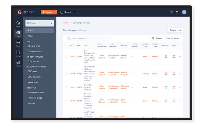
Current Solution
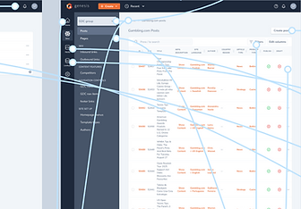
There were 12 parent folders and 173 subfolders sorted randomly, lacking in hierarchy with all items shown to the user at the one time.
This navigation made users read through each label to find what they're looking, making for a painful and tiresome experience.
Previous left navigation solution
Goals
Declutter and introduce hierarchy to the navigation.
Allow users more efficient access to their work.
Results Overview
Restructured the 12 folders and 137 subfolders into 5 primary navigation items.
Implemented breadcrumbs as a secondary navigation method.
Introduced 'quick create' shortcuts, giving users faster access to their primary goal.
Introduced a 'Recent' menu, which allows users to easily find and jump back into previously worked on material.
Introduced a bookmarking feature that allowed users to save files for repeated easy access.
Introduced dark theme navigation to reduce reported harshness on users' eyes, creating contrast and bringing their work into focus.
Process
Discovery
01
Stakeholder statement and syncs
Gathered product requirements. Set the scope and deadline.
Regular syncs set up for updates and feedback.
02
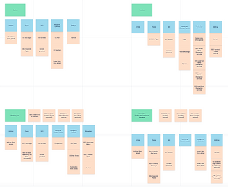
Card sorting
Users and stakeholders took part in a card sorting exercise. The 12 folders and 137 subfolders were sorted into an preliminary more intuitive structure.
03
Competitive benchmark
10 direct and indirect competitors were analysed to see how they approached navigation structure and for additional features.
Card sorting
Competitive benchmark
Wireframing, prototyping and user testing
01
Wireframing & Usability Testing
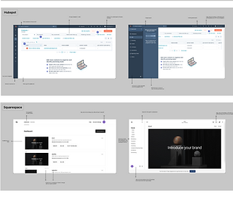
Wireframes were created and A/B tested to validate the new flow ideas. This round was focused on the high-level steps and functionality.
02
Hi-fi Prototype & Usability Testing
The designs were iterated based on user and stakeholder feedback. The high fidelity designs were created with the final UI and user tested again.
Prototyping
Usability testing
Results
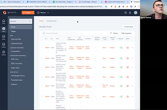
Left nav
Restructured the 12 folders and 137 subfolders into 5 primary navigation items.
Only one site's information is shown at a time through the site selector, only showing the user what they're interested in and preventing users from getting overwhelmed.
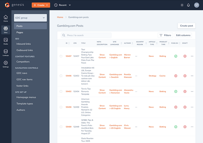
Top nav
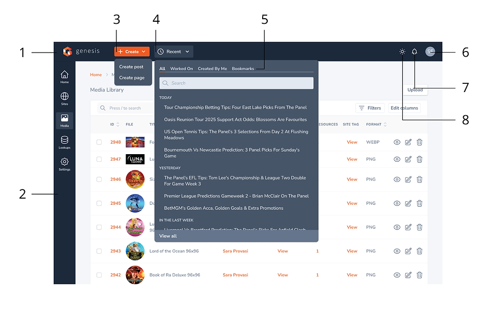
Quick 'Create' shortcuts, give users faster access to their primary goals.
'Recent' menu, allows users to easily find previously worked on material.
'Bookmarks' allows users to save files for repeated easy access.
Feature breakdown and design choices
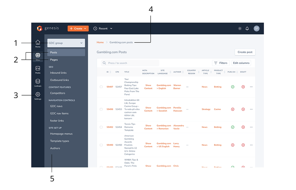
1. Site selector - Only shows the information for one site at a time
2. Language simplified - 'Site articles' and 'Site pages' renamed to 'Posts' and 'Pages'
3. 5 primary nav items ordered by usage data
4. Breadcrumbs added, as secondary navigation method
5. Second column only shows items specific to the site selected, ordered by useage data
-
Logo brings users to home screen
-
Navigation designed in a dark theme to contrast and frame the content. Users also report the previous white design strained their eyes overtime
-
Shortcut to create posts and pages - Users primary goals
-
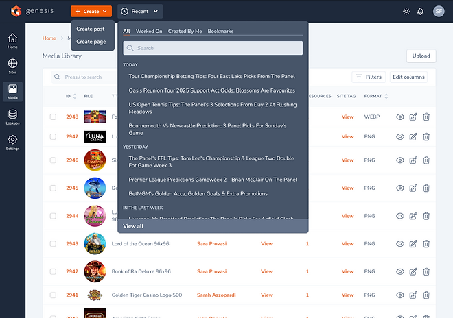
Addition of 'Recent' menu allows users to quickly access their work
-
'Recent' menu includes automatically displayed posts and pages categorised by 'All', 'Worked on' and 'Created by me'. Users can also saves posts and pages they wish to revisit
Takeaways
Key learnings
We began this project without full knowledge of the items we were sorting into our new menu and categories. This resulted in some guesswork, which led to initial mistakes. Going back and recording every item in a mapping doc and asking colleagues in the know to fill in each items description and purpose resulted in a more intuitive and accurately sorted menu. Although a mapping doc isn't the most exciting task, often it can bring clarity to the design and team.