Séamus Flannery
Content Editor

Overview
GDC Group is a company reliant on its web content ranking well on search engines, in order to drive traffic towards their sites. A vast quantity of content is therefore, created and edited daily for this purpose.
Role: End-to-end sole Product designer working with a product manager, PO and devs.
Timeframe: 4 Sprints (2 week sprint cycle)
Current Solution
The previous creation and editing process was dev-built, lacked visual hierarchy and showed all 37 fields to the user, regardless of whether they needed to be filled out or not.
Tasks were split between the create/edit screen, and the details screen. This meant users must jump between the two screens to complete all steps in the process.

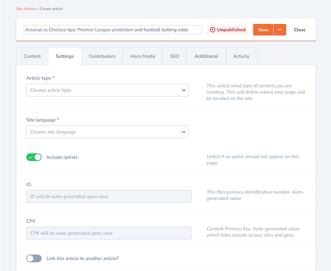
Create/edit screen
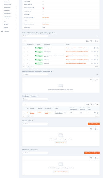
Details screen
Goals
Reduce article creation time by 20%
Improve visibility of system, to inform users of whats happening with the system.
Improve the user experience by improving the UI and reducing the amount of scrolling, clicks and time taken to complete article creation and editing.
Results Overview
Reduced article creation time from 8.21 mins to 5.58 mins, a 32% reduction.
Reduce excessive scrolling rate from 70% to 0%.
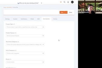
Removed the details screen and moved all functionality to the edit screen, removing the need for users to jump between two screens to complete tasks.
Improved accessibility by removing tooltips on hover and having help text appear to the right of each field. Help text can be toggled on and off from the nav.
Introduced improved and targeted error feedback to help users complete their tasks.
Process
Discovery
01
Stakeholder statement and syncs
Gather product requirements. Set the scope and deadline.
Regular syncs set up for updates and feedback.
02
Card sorting
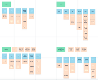
The 37 fields were placed on to cards and sorted by users and stakeholders into intuitive groups. These groupings became the initial tab structure.
03
Mapping doc
Existing fields were mapped to a google doc breaking down what user group used them, for what purpose and their new tab location. Along, with their updated labels and help text.


Syncs
Card sortings
Mapping doc
Key data
01
Creation vs Editing
The initial brief instructed for a creation wizard. Google Analytics showed that in a week, articles created equalled 207, whereas articles edited equalled 799. Based on this metric I recommended we switch to tabs over a wizard.
02
Scroll distance
Microsoft Clarity revealed 80% of users were scrolling to 75% scroll depth. To reduce this important information should be moved above the average fold position of (819px).

Clarity heat-map
03
Important fields
Clarity revealed, that there were key fields repeated used for editing. These fields must be easily accessible and towards the top of the form.

GA path explorer
Wireframing, prototyping and user testing
01
Wireframing & Usability Testing
Wireframes were created and tested to validate the new flow ideas. This round was focused on the high-level steps and functionality.
02
Hi-fi Prototype & Usability Testing
The designs were iterated based on user and stakeholder feedback. The high fidelity designs were created with the final UI and user tested again.

Prototyping
User testing
Component library and annotations
A design library was created of the components, colours, fonts etc. included in the design.
Annotations were added to the designs covering scenarios, variations and any team questions so nothing was left to guess work.
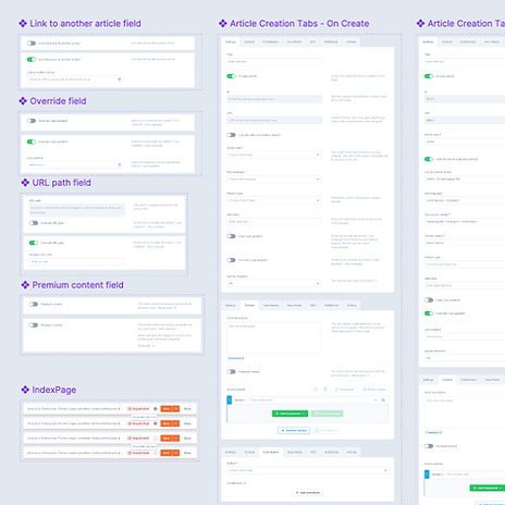
Design system

Annotations
Results
Tabs
Reduced article creation time from 8.21 mins to 5.32 mins, a 28% reduction.
Reduce excessive scrolling from 70% to 0%.
Reduced number of rage clicks experienced by 85%.
The details screen was removed entirely. Bringing all create/edit tasks to the one screen.
Feature breakdown and design choices
-
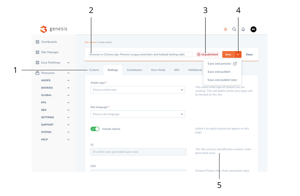
Users create their content before anything else, so content was moved to tab no. 1
-
Title field moved to a floating tool bar
-
Publish status of article now display prominently. Click-to-edit status
-
Reduced number of button on screen by introducing a split button

-
Feedback added to aid the user in completing fields
-
Upon save, if a mandatory field is incomplete, the tab containing that field will show as an error
-
All elements that were in use on the details screen were brought to the create/edit screen. Removing the need for users to jump between the two screens
-
The SEO tab groups all relevant fields together for the SEO user group. This removes the need for SEO user to view or sort through any other fields
-
Upon save, feedback messaging appears, notifying the user of errors. The messaging also directs them to the exact field causing the error
Takeaways
Key learnings
Ignoring developer constraints and aiming for a best-in-class design was a mistake. We had to simplify the design after time-consuming testing and iterations. Listening to developers earlier would have saved time and led to an earlier project delivery.
Replacing hover tooltips with help text next to each field improved accessibility, as screen readers can't read hover content. I feared it would clutter the design, but most users found the text easier to digest, and it could be toggled off from the top nav. Accessibility should always be built into every design.